7 Tips for perfecting your first digital workbook

Here are the Wobo team’s top recommendations for building your first digital workbook.

By Wobo TeamJanuary 9, 2023


At Wobo, we’ve helped hundreds of course creators set up workbooks to help their students interact with their course content in an engaging and memorable way. There are infinite ways to make your workbook pop, but we’ve rounded up some of our top recommendations that you might not have considered when building your first digital workbook.


Start at the end

Wait, what?


What we mean is: when planning your workbook outline, think first about how a student’s downloaded version should be structured.

In Wobo, there are two options for students to download their work: by module (a group of workbook exercises) and by workbook. This means all of the content that you want downloaded together at the end should be in the same workbook. You can however, allow students to download modules from a workbook individually, without downloading the entire workbook.
 

Picture your Student Experience

While creating the outline for your workbook, think about how you want it to be encountered by students. Should they see cover pages before each module? Which sections or workbook exercises should be grouped together in the same module?

Our general advice on workbook structure: 
 

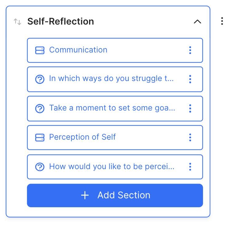
  • Picture a student encountering your workbook in a course. Let’s say it’s an end-of-chapter worksheet after a series of video courses in a platform like Thinkific. Everything that should show up in that workbook should be grouped into the same module in Wobo.

    Screenshot 2023-01-05 at 3.04.26 PM.png
     
  • You don’t need to have a cover page on each module, especially if you’re not a designer and making them will eat up a lot of your time. If you want to spice your workbook up later, you can add them, but for your first workbook, just stick to the workbook cover page and don't bother with cover pages for each module.

Don’t forget about mobile!

In Wobo, everything you add is automatically mobile-friendly (phewph!) One thing you should check is your cover pages: are they legible on mobile? Is anything cut off when the image is re-sized to the dimensions of a phone?

Here’s what we recommend:

  1. If you’re uploading a full-page cover page, avoid putting text close to the edge. Instead make sure there is a decent amount of space so that when the image adapts to different screen sizes, nothing is cut off on the edges.
  2. Avoid super small text: images will need to shrink down to fit on a phone screen, so make sure your text is large enough that it will still be legible.
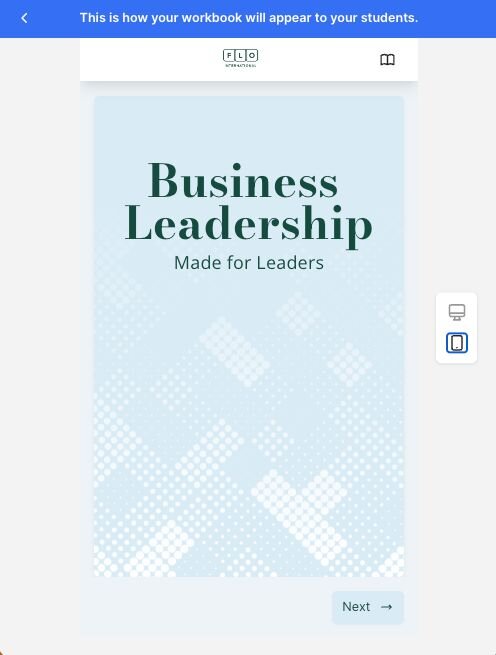
  3. In preview mode, click the phone icon to see how your workbook will look on a mobile device:
     
Screenshot of the Wobo platform. In preview, users can switch between desktop and mobile to preview across devices.

Add Alternative Text to Images

Whether or not your company is legally required to adhere to certain accessibility standards, make sure to take a moment to add alternative text to your images.

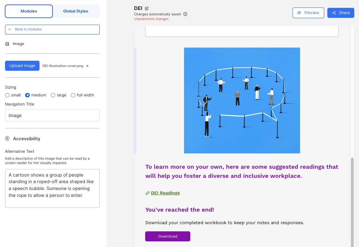
Adding alternative text to images ensures that all of your students will be able to understand your workbook content. In Wobo, when you add an image, you can also add alternative text that will be read aloud by a screen reader when the image is encountered.


Screenshot of the Wobo platform showing how alternative text is added: A cartoon shows a group of people standing in a roped-off area shaped like a speech bubble. Someone is opening the rope to allow a person to enter.

Do a Contrast Check

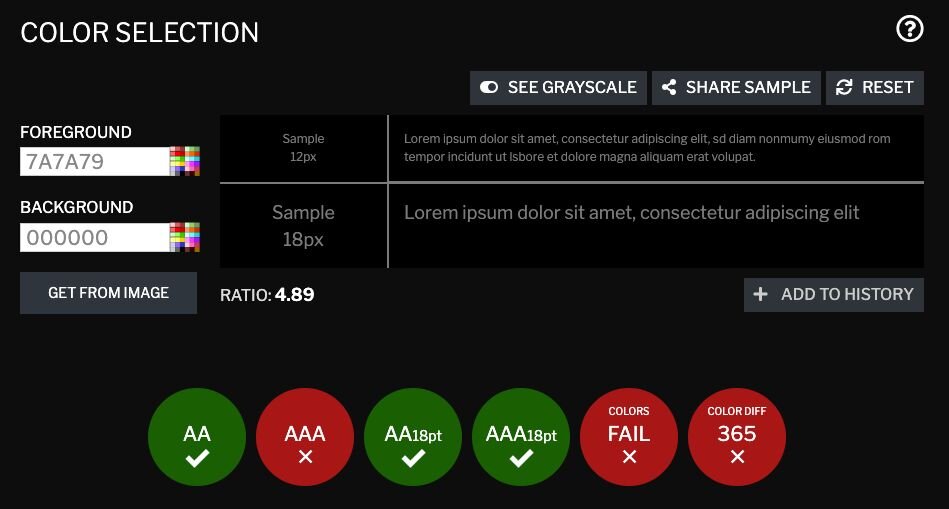
Students with low visibility or colourblindness might struggle to read text that is placed on a background with low contrast to the text colour. Use a tool like https://contrastchecker.com to make sure your background colour and text colours will be suitable for all of your users.


Screenshot of a colour contrast tool that allows users to enter a foreground and background colour to see if the contrast is sufficient to support low vision users.

Avoid putting text in images

There are a few reasons we recommend that text in your workbook be typed out rather than inserted as an image:

  • Readability on mobile: since images shrink down on mobile, text that looks great on a computer will likely not be legible on a phone screen.
  • Difficulty to translate: for students who might need to translate your text into their first language to understand a word or phrase, having it in the workbook as text is much easier than re-typing everything.
  • Accessibility for screen readers: While you can (and should!) insert alternative text to describe the text in the image, if it’s a table for example, this could be much harder to interpret for someone using a screen reader compared to how a table with text could be navigated using keyboard commands.
     

Get creative!

Our final piece of advice is to present exercises in different ways to keep your content engaging. If you’re finding a lot of your content is requiring the same type of input, ask yourself: could this response be a slider, a checkbox, or a table to provide some variety?

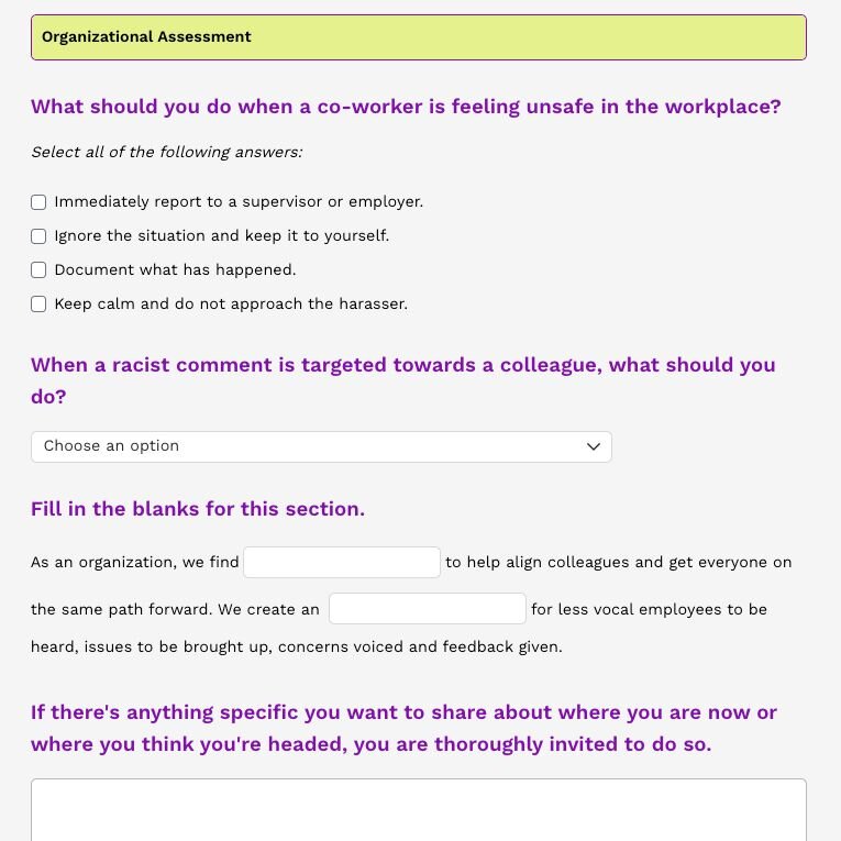
Don’t forget that Wobo comes with a bunch of templates to help you get inspired. Here’s a sample from one of our templates that uses a bunch of different section types.


Tip: See the green header? That’s a table with just one row and one column being used to style a title - try it for yourself!


Screenshot of a Wobo workbook showing a variety of different input types: checkboxes, drop-downs, fill in the blanks.


Start a free trial of the Wobo interactive workbook software today. It’s the professional software you need to create a workbook that’ll take your students' learning to the next level. 
More students and sales await.

Empower students to take notes, complete structured exercises, and best of all, retain all their work once the course is complete. Sign up for email updates or book a demo to learn more.